Church of Scotland | March 2018 - March 2019
Originally built desktop only as the client had an app they used to target devices this rebuild then had to incorporate both.
Personally, I would never build a customer facing website that isn't reactive, with the volume of mobile users these days it makes every bit of sense to accomodate for them regardless of having an app as well. The original idea was that this would be slotted in to a WordPress build which given the information on the site itself, this would've been fit for purpose.
However, there was an issue when it came to design where it totally changed views for certain pages and having to pick away at WordPress or potentially rely on a variety of plugins to cater for the different requirements was a no in my book. For these reasons I pushed at a bespoke CMS system, it caters for the users needs and also allows for modules to be slotted in with ease due to the style of build.
The system is built in Laravel framework, and makes use of a third party dependency for quick access to the request headers and system information that is accessing the site. This allowed me to point the software to the correct view if it was mobile, tablet or desktop.
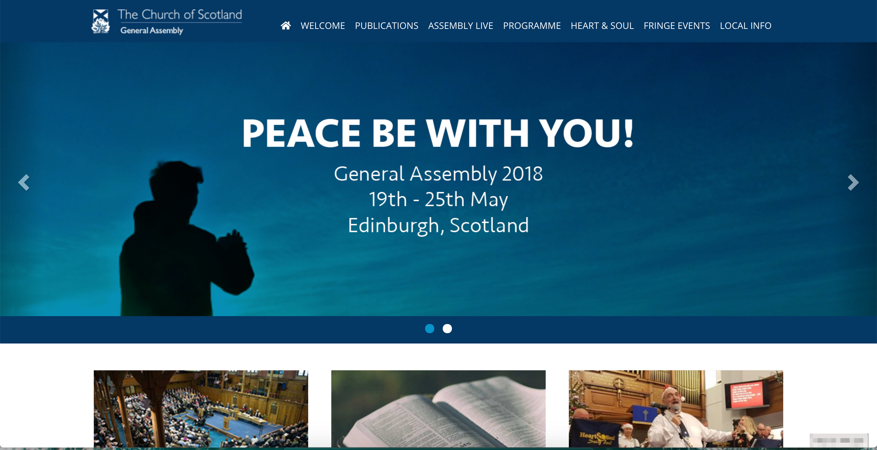
The site itself runs on an annual basis more or less, where it's only used when the General Assembly is in progress. This means that for about 70% of the time the site is pretty inactive, however the site holds an archive of the papers provided from the services and thus allows the download information about these to be tracked and relayed back to the customer to see what's the most popular (given there is typically 3 file formats per publication).
Head on over and check it out: https://www.gapublications.co.uk/